File this one under “How the heck did I let this one slip past me?” I’ve just discovered Elevation Profiles for Paths in Google Earth. I have no idea when this became a part of Google Earth (years ago?) but I came across this feature as I was plotting my river routes for my Backyard to Ocean post.
For any given path in Google Earth, you can select Elevation Profile and it will display a graph showing the rise and fall of that path from sea level. This works for ANY path, regardless of length or the number of anchor points. For demonstration sake, though, I like to use a path with only two anchor points – a beginning and and end.
Let’s say, for example, that you create a straight line path across the continental United States. You have two anchor points – one on the west coast, and one on the east coast. Your path would look something like this…
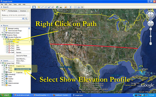
Once you have saved that path to My Places, you can right click on the path and select Show Elevation Profile from the menu. That would give you a graph like this…
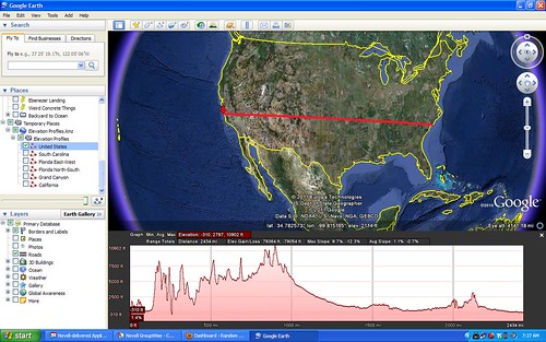
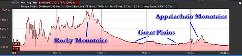
Here you can see a cross-section of the US based on that path. Clearly visible are the Rocky Mountains, the plains, and the Appalachian Mountains. On this graph, the Appalachians look tiny compared to the Rockies.
Straight line graphs like this are great for showing terrain. Here’s another example using the Grand Canyon…
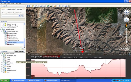
You can see one of the “temple” features rising in the middle of the canyon, and it’s clear that the southern rim is lower than the northern rim.
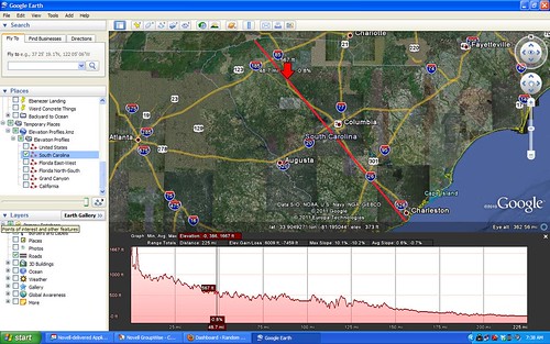
This technique is great for illustrating the geography of a particular state. In South Carolina we have the mountains, the Piedmont, the Sand Hills, then the Coastal Plain. These geographical features are seen very clearly in this profile…
The X-Y scales, though, can sometimes be deceiving. Florida, for example, is a relatively flat state, yet its east-west elevation profile looks like this…
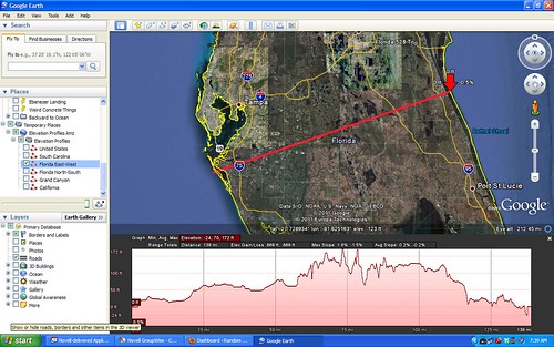
This makes it look like Florida has mountains. However, you have to consider that the highest point on this graph is only 172 feet. The differences tend to be exaggerated.
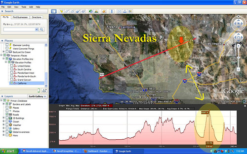
One really cool feature in Elevation Profiles is a red pointer on the path that shows the elevation at any give point along that path. For example, I created this cross-section of the state of California. In this image the red pointer is showing the highest point on the graph, and on the map it is hovering over the Sierra Nevada Mountains.
In this image I’ve moved the pointer to the lowest point on the graph, and on the map it shows the red pointer hovering over Death Valley.
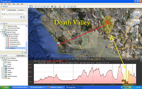
In addition to these features, you can see the central valley and the coastal range on the Elevation Profile.
I can think of LOTS of ways this might be used in the classroom. Showing state profiles is just one way. You can have students plot a path over a mountain and see which might be the easier route based on the Elevation Profile. You could look at the profile of the route of the Tour de France, or any other race, for that matter. Lots of possibilities.
Elevation online http://www.geocontext.org/publ/2010/04/profiler/en/?topo_ha=2010115824317151 – faster!
The problem with Google Earth elevation profiles is the vertical exaggeration. When looking at whole continents or even whole states/provinces, it’s not too bad. But when looking at a small area of, for example, the Prairies, the elevation profile generated by Google Earth makes them look like the Himalayas due to the extreme vertical exaggeration applied – and I have yet to find a work around.
Interesting, you have a big head start on something I was contemplating. Can that be flipped to show you a level or downhill grade from point a to point b?
Would like to see your commentary on that.
Regards,
Brian Canose