Huge changes at Flickr – some excellent, some not so good, and some downright deceitful. Right now I’m still processing how I feel about all this, but here are some of my initial thoughts…
Layout
At first glance I really like it. It looks clean and professional, and highlights the photography in a very flattering way. I especially like that it goes to a full screen view of the photo automatically, with comments, etc, down below.
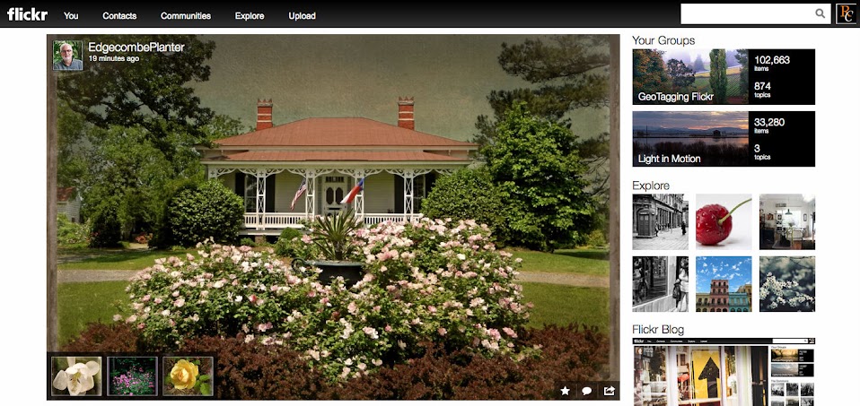

There are a few drawbacks, though. Collections seem to be missing. This is one of the MAJOR ways that I organize my photos. I have multiple sets, usually one for each outing, and the number of sets can be unwieldy. If I can organize those into broader categories, that helps. The Collections link is tucked away on an obscure link to the right. I think it needs to be up there with Photostream, Sets, and Favorites.
