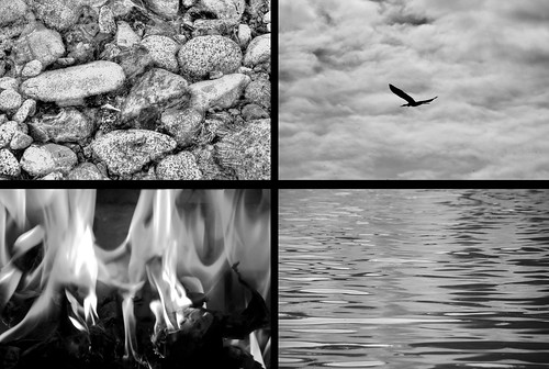
Over the weekend Laura told me that they were looking for artwork for the new Chemistry Department offices. Furman has completed a renovation of Plyler Hall, which is now part of the Townes Science Center on campus. The Chemistry Department has large blank walls that are just begging for some artwork. Laura suggested something semi-abstract dealing with the classical elements, so I thought I would see what I could create. The image above is the result.
The classical elements are earth, wind, fire, and water, so I set out to capture those. First was “water”. I was at Furman Sunday afternoon taking pictures and spotted sunlight reflecting off the rippled water in one of the fountains. Looked like a perfect candidate for me, so I snapped it.
Next was “fire.” I crumpled up newspaper in our fireplace and lit it (forgetting to open the flue and setting off the smoke alarm in the process.) I took lots of shots at various focal lengths and orientations. The final shot is actually a composite of several shots, combining various tongues of flame I liked from different shots while covering up obvious bits of newsprint and ash.
I’ve got a collection of river rocks I had planned to use for “earth.” However, it turns out that I already had a photo of river rocks that I took on the Skagit River in Washington State and hadn’t posted anywhere else or printed. Even though the image was originally rejected as not being sharp enough, it was perfect for what I needed. I added a Gaussian blur overlay to bring out more details, then monkeyed with the levels and exposure a bit until I had what I wanted. It just goes to show that you shouldn’t delete rejected images – you might still find a use for them.
Three down, leaving just “wind.” How does one photograph something invisible? The only possibility is to use a metaphor, or capture the results. Lots of ideas ran through my mind, such as billowing flags or fabric, blowing streamers or smoke, or even dandelion seeds. Online I had seen several expansive views of the sky with blowing clouds that might work. However, there was not a cloud in the sky, and I was going to make sure I used my own photography for this and not just steal the nice images I found online.
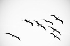
So, it was back to my image catalog. I found several shots of birds in flight that seemed to sum things up nicely. The first image I selected for this quartet is shown below:
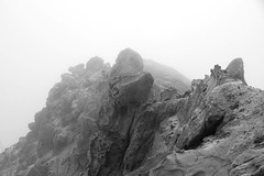
I actually like this one a lot better. However, the wide open sky didn’t seem to fill the frame like the rest of the images, so it didn’t fit compositionally. I toyed with the idea of using another image for “earth” to balance the top images:
I took this one of Point Reyes north of San Francisco, and thought that the fog might balance the open sky.
In the end, I decided upon shots that filled the frame rather than the ones that had lots of open areas. I like the two alternate shots, and will probably print and frame these for some other purpose.
For all four of these images I desaturated them, then created two versions. One version is just the black and white as shown here. The other version uses faux coloration for each segment. I personally like the black and white best. The idea is that each of these would be framed separately and mounted on bright red wall in the chemistry offices. Since there is already so much rich color, I thought the desaturated images might be a nice contrast. I guess we’ll see if the department likes them and if they actually get installed.
And on a side note, Laura and I first met outside of Plyler Hall at Furman Homecoming. During the Friday night festivities we stood on the mall and listened to a reggae band called The Elements. It was good chemistry on multiple levels, and continues to be so.


Cool! I rather like seeing all four images on the same print myself. I too like the monochrome. One variant would be to use a form of selective color to print each image in a color dominant to that concept. For example, yellows and oranges (a range of closely related hues) for the fire, blue/greenspurples for the water, earth tones for … earth, and I’d go grayscale for the wind shot, with some hints of greyed color (as grey is a neutral anyway that can have shades of blue or purple or whatever fit the scene originally).
Another thought: there is an American Indian symbol that gets some use in health areas. I used an adaptation in a logo for one of our Clemson groups. It ties the elements together rather nicely, though the composition actually varies from versions to version. I don’t know, but maybe a color version of that (in the center 1/4) overlaying your images in the background in grayscale might look rather sharp too. Of course, there’d be the obvious need for an explanatory note so people know what the symbol is about and why it’s juxtaposed with the images.
Cool stuff. I’m glad the Chemistry folks are looking for that sort of art expression.
I like the images you selected. I wasn’t sure what you were up to when I saw them on Flickr yesterday.
Even framed separately, I think they would look good arranged on the wall into a block as you are showing it here.