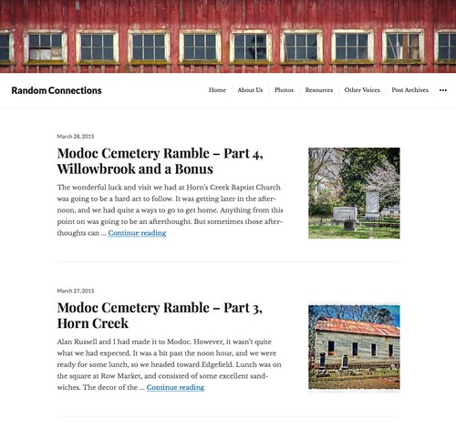
You may have noticed that something has changed. I decided to go for a new look and feel for the RandomConnections website.
I’ve never been completely happy with the appearance of this website…until now. While each of the themes I’ve tried out over the years has its merits, none really gave me the effect I was after. The last one came close, but I didn’t like the font readability (or lack thereof) on the main body of the posts.
The new theme puts the emphasis on storytelling, while still letting me showcase photos. Flexible themes on sites such as Medium and those offered by the web host Squarespace are now the popular trends in web design. I really like that effect, and was looking for something similar for this site. I decided on the Resonar theme, with a couple of tweaks.
I’ve got nearly twelve years of posts on this site, and folks are still coming back to visit some of the older ones. I needed something that would make current posts look like I want without breaking the older ones. That’s tricky. For example, this one from 2004 has no photos, but looks good in the new template. This one from 2006 uses some old HTML to display the images, but still works.
As I said, the focus is the stories. There’s lots of white space and your attention is drawn to the middle of the screen. The font is large enough and the typography much easier to read. The site displays well on mobile devices, as well.
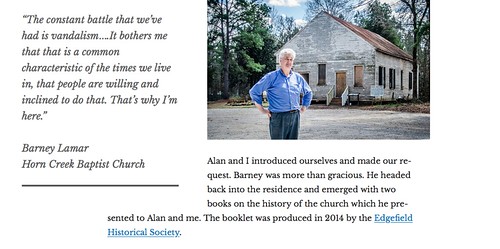
One of my favorite things about the new theme is the ability to use pull-out quotes. These enhance the story and add interest.
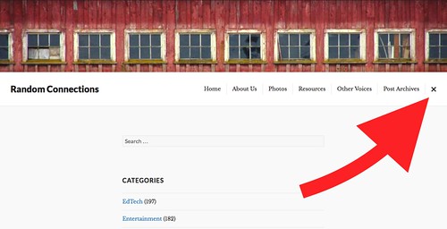
With the focus on the stories this template eliminates distracting features such as the menus on the right and all of the social media stuff. Those features are still there on each page, as well as enhanced search and organization features, but they are now hidden behind a drop-down menu.
Even though I think this theme will better meet my needs, there are still a couple of things that aren’t quite perfect, but I can live with them. I still get to keep my rotating banner images, but the width has been greatly reduced to just a small strip. Oh well.
My main complaint, though, is not with the theme, but with WordPress itself. Many WordPress themes use something called a “featured image.” These are the thumbnails you see on the main page, and are often highlighted at the top of a post. WordPress won’t let you use images hosted on a remote site, such as Flickr, as a featured image. My only choice was to upload a featured image to my local WordPress site, using up limited web space on that server. That’s why I GOT Flickr in the first place, and it frustrates me that WordPress doesn’t allow this.
I did find a plugin that will let me pull in remote images…sort of. The images show up on the front page as a thumbnail, which isn’t ideal, but they don’t display as they should on the post page. Instead, you see a black banner over the post title where that featured image should be, and I have to re-embed the image at the top of the post.
Those are minor pains, though, and all of that happens behind the scenes where you, the visitor, never need worry. So far I like the effect and the way everything looks. I think I’ll live with this awhile.


Like everything WordPress, there’s a plugin for that, https://wordpress.org/plugins/wp-remote-thumbnail/. Or did you try that? Would be nice if it were baked in, though, since you can use remote images in posts.
I had tried (and am using) a couple of them, but I hadn’t seen this one. I may give it a try. Thanks!
WordPress’s response is that they are doing this to prevent bandwidth theft. Is that even a concern anymore? It really makes no sense when so many of us are hosting images in off-site repositories.
Just tried the WP Remote Thumbnail plugin, and it doesn’t like to play nicely with the rest of my WP setup. Since I’ve already gone back and changed many posts to use the Nelio external featured image plugin, I think I’ll just go with it as is. Thanks for trying, though.