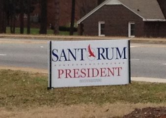
When I saw the campaign sign above my first thought was, who is Saint Rum and why is he/she running for president? With a name like that, this might be someone I could really support!
Seriously, though, this points out the problem with typography. These candidates, regardless of party or office sought, are limited to certain themes and colors. Only red, white, and blue are acceptable. Certain symbols are acceptable, such as stars, eagles, and other national emblems. That leaves only a limited number of combinations.
In this case Santorum is hoping that the O of his name because a shortened symbol on its own, in much the same way Obama’s O took on a life of its own. In fairness, the blue version of this sign is much more legible because the O remains white.
However, there is a risk. Obama’s O was indeed iconic, and lent itself to inclusion in words such as “hope.”. But that was easily parodied in bumper stickers sporting the word S”O”cialist, as well as others. Should Santorum be elected, I’m sure his “O” would suffer the same fate.
Personally, though, I’m ready for a departure from the red, white, and blue with politically acceptable imagery. Maybe it’s time for something like this…


Santorum’s O could have been made more effective with just a little imagination. I thought of about 5 ways in under half a minute. 🙂 But I’m an unemployed designer, so … maybe I didn’t make enough mistakes to stay employed? 🙂