I had lunch at our local Wendy’s yesterday. Looking up the street I was struck by something. See if you can spot it…
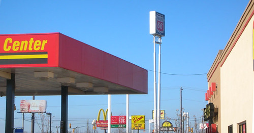
Here. I’ll make it a bit more obvious in this collection of logos…
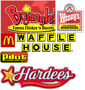
Notice how all of these companies use shades of red and yellow in their logos? One might argue that Waffle House doesn’t really have red, but their buildings have red trim just below the roofline. I couldn’t find the logo for the L’il Cricket convenience stores (no website), but their logo is also yellow and red. One other one not visible from the photo above, but with the same color scheme is Pizza Hut…

I have to wonder why all of these fast food and convenience centers use the same colors. Is there something about yellow and red that imply speed or quick service?
Perhaps there is something even more basic going on here. Take for example, the Plain Tiger Butterfly (danaus chrysippus). The Indian Fritillary Butterfly (Argyreus hyperbius) and the Leopard Lacewing (Cethosia cyane) exhibit Batesian Mimicry, so named after naturalist Henry Walter Bates, who first documented this phenomenon in the Amazon in the mid-1800’s. In this example, the Plain Tiger is toxic to predators, whereas the Indian Fritillary and the Leopard Lacewing are not. However, these latter two have evolved with the same coloration so that predators will avoid them as well. Images from Wikipedia appear below as examples. The first is the Plain Tiger, the second is the Indian Fritillary, and the third is the Leopard Lacewing…


Oddly enough, these also seem to be in shades of yellow-red-orange. Perhaps there is a bit of mimicry going on with the fast food and convenience centers as well. In the case of the companies, it would be more like Müllerian mimics (named after Fritz Müller) where the species do share related characteristics (or, at least, one would hope.)
I guess there’s something about that yellow-red combination that has a primal connection with "food." In the case of the butterflies, it’s "Stay away!" The opposite is true with the companies with logos pictured above – "Come here and eat me!"
UPDATE: Thanks to the many comments and suggestions, I have two more data points…


Perhaps we should heed the yellow and red color warning about those places. Not one of them is good for your health.
alot of foods, candies and drinks are bad for you. But some of us like to enjoy our life a little bit.
my guess is that their signs are red and yellow because they are bright, attention grabbing colors. the eye immediately goes to these bright colors. the same reason why bright red cars get more speeding tickets then any other color car. if a fast-food signs were blue or green they wouldnt be as eye catching.
Red and yellow are actually used because it triggers hunger in one’s mind. Hence the reason why so many big name restaurant chains use red and/or yellow as their main colors. Yes, it is true that the colors are eye popping but the big reason is because it triggers a feeling of hunger in the back of one’s mind.
And it’s not limited to their colors — Wendy’s always locates their stores near a McDonalds, reasoning that McDonalds has already done all the research necessary for placing a store at that location…
Actually, the colors red and yellow have more to do with human psychology than mimicry. Red in particular is considered the most “appetizing” color by the human mind, while colors such as blue are thought to be possible appetite suppressants. Ask any finishing school or charm school teacher (or a psychologist, for that matter).
In graphic design color theory classes you learn that yellow is supposed to be associated with quickness and speed, and that red is supposed to stimulate appetite. They’re also 2 of the easiest colors to see from far away…hence why they are used on emergency vehicles.
Red and Yellow are the colors rated to most stimulate hunger. There you go, that’s your answer. I’m sure there’s links about it on the web. Thus Red and Yellow are preferable (evolutionarily speaking) in the fast food industry.
You’ll probably find it’s more to do with basic design issues about which colours advance furthest in the colour spectrum rather than any food connection. Warm colours are overused because they advance further than cold ones. Red and yellow work well together and can also be easily converted to black and white for use in monochrome ads.
You see the same thing in the print world, cheap tabloid mags also overuse red and yellow for the same reasons. This has the result on the magazine racks that you see at the roadside, everyone is shouting at the same volume so no one’s voice is prominent.
Oh, and the above comment is based on studies conducted on humans, and hence, only shows this color “preference” for humans. I’m not sure if that was clear or not.
or the fact that red and yellow are the most visually attracting colors to the eye. It’s meant to grab attention.
I’ve always been told that red, mixed with yellow, is said to induce hunger, and rushing.
Who knows how much it actually works..?
http://en.wikipedia.org/wiki/Red
Very simple explanation: “Red, along with yellow and orange, is thought to provoke hunger, hence its use in logos by food vendors.”
http://en.wikipedia.org/wiki/Red
Even if it’s not true, it’s believed to be true, hence all the red and yellow on food signs. In addition, they are some of the most eye catching colors.
I saw a link to this on boingboing… I think I can shed a little light on this for you. While I can not give you a link to back this up I remember taking either a color theory or psychology class and discussing the effects of color. In the same way that pink has a calming effect, the colors red and yellow (orange can be included too) have an effect of inducing hunger or at least encouraging the viewer to want to eat.
Okay I just did a quick search and found this ( i am not sure the validity of this site but it sort of explains things) http://psychology.about.com/od/sensationandperception/a/colorpsych.htm
I am assuming that the fact that red and yellow evoke feelings of comfort are a reason that resturants might use these colors the site also says that yellow can increase metabolism and that definately could encourage one’s appitite.
hope this helps to shed some light. sorry it is a bit scatter brained.
I was told in high school psychology that red and yellow caused the brain to issue hunger responses. Now, my high school psychology teacher was (IMO) a quack, so take it for what it’s worth.
I have heard that fast-food restaurants use these colors because they are at once attractive and agitating. So the customer is drawn in by the bright colors, but is also by that garishness encouraged not to hang around for very long. Makes sense to me.
Seems I remember something from color theory class about this. These colors have been found to stimulate a hunger response.
Actually, there are significant studies done on what practically each color in the spectrum does to a person’s brain.
My boyfriend works in advertising, and when he was in college one of the first things they said was, “McDonald’s changed the way America advertises by converting to a purely red and yellow palette after a university published findings that they were the most agitating colors.”
The curious part here is ‘agitating.’ McDonald’s doesn’t want you to be comfortable and hungry, they want you to be uncomfortable. They want you to leave after you’ve purchased your food. What was the biggest problem of the diners of the 50’s? People would bring their families and sit around all afternoon after only ordering a small amount of food. The entire concept behind McDonald’s switched to “Get your food quickly and leave.” It meant nothing more than faster turn-over and more money. People get hungry on their own, they generally don’t have to be encouraged to do so.
It’s not really surprising then that other food chains have converted to judicious use of either red or yellow or both in combination. If they were blue or pink we’d be compelled to sit around and waste their money.
my first thought was: bojangles!
http://www.adaptivedisplays.com/Media/Bojangles.jpg
The color red is thought to stimulate hunger. That’s why they choose it for their logos.
Psychologists have done research proving that the colors yellow and red cause people to get hungry; it seems as all the fast food joints have picked up on this info.
I remember a note from a psychology study about this. Apparently red/orange is associated with hunger. In other words it is no cooincidence, and marketers latched onto that.
Don’t the companies use these color combinations for the extreme contrast between the colors. They stand out…
Yeah, I figured it had something to do with the psychology of colors and graphic design more than anything, but the comparison was just too hard to resist.
Like others here have said, red and yellow are harsh and make for quick leaving customers. I think orange also falls into this category, because that is the third most used color you’ll see in fast food places.
Red and yellow cause people to repeat the same information about the psychology of colour over and over and over.
Don’t forget Taqueria Pendejo
Red is the color of fire and blood, so it is associated with energy, war, danger, strength, power, determination as well as passion, desire, and love.
Red is a very emotionally intense color. It enhances human metabolism, increases respiration rate, and raises blood pressure. It has very high visibility, which is why stop signs, stoplights, and fire equipment are usually painted red. In heraldry, red is used to indicate courage. It is a color found in many national flags.
Red brings text and images to the foreground. Use it as an accent color to stimulate people to make quick decisions; it is a perfect color for ‘Buy Now’ or ‘Click Here’ buttons on Internet banners and websites. In advertising, red is often used to evoke erotic feelings (red lips, red nails, red-light districts, ‘Lady in Red’, etc). Red is widely used to indicate danger (high voltage signs, traffic lights). This color is also commonly associated with energy, so you can use it when promoting energy drinks, games, cars, items related to sports and high physical activity.
Yellow is the color of sunshine. It’s associated with joy, happiness, intellect, and energy.
Yellow produces a warming effect, arouses cheerfulness, stimulates mental activity, and generates muscle energy. Yellow is often associated with food. Bright, pure yellow is an attention getter, which is the reason taxicabs are painted this color. When overused, yellow may have a disturbing effect; it is known that babies cry more in yellow rooms. Yellow is seen before other colors when placed against black; this combination is often used to issue a warning. In heraldry, yellow indicates honor and loyalty. Later the meaning of yellow was connected with cowardice.
Use yellow to evoke pleasant, cheerful feelings. You can choose yellow to promote children’s products and items related to leisure. Yellow is very effective for attracting attention, so use it to highlight the most important elements of your design. Men usually perceive yellow as a very lighthearted, ‘childish’ color, so it is not recommended to use yellow when selling prestigious, expensive products to men €“ nobody will buy a yellow business suit or a yellow Mercedes. Yellow is an unstable and spontaneous color, so avoid using yellow if you want to suggest stability and safety. Light yellow tends to disappear into white, so it usually needs a dark color to highlight it. Shades of yellow are visually unappealing because they loose cheerfulness and become dingy.
more at:http://www.color-wheel-pro.com/color-meaning.html
P.S. don’t get me started with the hidden symbolism in advertising..i.e. Shell Oil, The 666 in Walt Disney Signature or the 13 in the Arby’s advertising….That is New World Order Adveritsing…for more on that check out David Icke, Alex Jones, and Texx Marrs.
L’il Cricket
Ketchup. Mustard.
It’s not really hidden symbolism or fast food psychology. It’s even more simple.
A blue sign will get lost in the sky. A green sign will blend in the trees. A white sign will quickly get dirty and is most likely to show the light bulbs through the plastic.
McDonald’s golden arches didn’t start with the M, they started with the arched roof supports of the original restaurants. Rather than use expensive Neon lights, they covered regular fluorescent bulbs with hard yellow plastic covers. They were more visible from the street at a greater distance and much less expensive.
The yellow plastic is also much less prone to fading or yellowing, it’s already yellow. The red plastic also fades slowly because of the heavy saturation of color.
and don’t forget: Burger King uses red & yellow with a blue crescent around the “bun”. The old Taco Bell logo was Yellow & Red as well. The new Taco Bell logo is unusual in that it has lots of purple in it, though the center image of the bell is nearly hot pink with a yellow center.
You’ll find that a lot of places will use red but not yellow: KFC, Jack In The Box, Arby’s, & Chick-Fil-A are all Red & White.
Li’L cricket Logo:
http://www.localbenefits.com/national/states/sc/Regions/Upstate/clients/BZ/13/1341/lil%20cricket%20logo.jpg
Don’t forget Red Robin:
http://redrobin.com/Images/Shared/TopMenu/rrLogo.jpg
Engulftron has it. Jeez, some people overanalyze everything.
I love how so many people are trying to explain it away as something other than mimicry.
Look at all the convenience stores that use green, red, orange and white to mimic 7-Eleven. Care to explain away that phenomenon?
Add another log to the fire:
http://www.advanceautoparts.com/
You missed a couple.
Burger King
http://en.wikipedia.org/wiki/Image:Burger_King_Logo.svg
Dairy Queen
http://en.wikipedia.org/wiki/Image:DairyQueen.png
Krystal
http://en.wikipedia.org/wiki/Image:Krystal_logo.jpg
Arby’s
http://en.wikipedia.org/wiki/Image:Arby%27s_logo.svg
KFC
http://en.wikipedia.org/wiki/Image:KFC2006.jpg
Popeyes
http://en.wikipedia.org/wiki/Image:Popeyes2.jpg
Church’s Chicken
http://en.wikipedia.org/wiki/Image:ChurchChickenlogo.gif
Rally’s
http://en.wikipedia.org/wiki/Rally%27s_Drive-In
Jack in the Box
http://en.wikipedia.org/wiki/Image:Jack_In_the_box_fast_food_svg.svg
There are, though, several fast food chains that break the usual colors.
Culver’s
http://en.wikipedia.org/wiki/Image:Culver%27s_Logo.svg
Taco Bell
http://en.wikipedia.org/wiki/Image:Taco_Bell_logo.svg
White Castle
http://en.wikipedia.org/wiki/Image:White_Castle_logo.svg
Domino’s Pizza
http://en.wikipedia.org/wiki/Domino%27s_Pizza
Long John Silver’s
http://en.wikipedia.org/wiki/Long_John_Silver%27s
Steak ‘n Shake
http://en.wikipedia.org/wiki/Image:Steaklogo.gif
If I had to guess, I’d say that it all comes from that classic idea of a burger joint that always has that red and white checkered look. The red and white checkered look is still evident in old-style eateries like Big Boy and Johnny Rockets, too.
The “red cars get more speeding tickets” bit is a myth. Red cars get no more tickets then any other color. You can find a debunking on Snopes.com or just call your insurance agent, ask if they charge more for red cars (‘cause if the numbers said more tickets they’d raise rates accordingly.)
As to the psychological impact of the signage color, that’s pretty minimal when it’s outside, a few square feet of signage, up on a pole, or mounted on the roof of the venue. I somehow doubt the mere sight of red in .00001% of one’s filed of vision is going to spark urgent pangs of hunger.
Inside is where you’d expect color choices to to have some effect and it is true that fast food dining rooms do tend to use red & similar “warm” colors in their interiors. Also white. And fake wood. And freakish cartoon characters. Make of all of that what you will. I’m just glad that the pinks & teals of the 80’s are now mostly cycled out.
Indeed I’d be curious to see any real science (not vacuous advertorial for color chart reading) that backs up red or yellow as having significant psychological impact beyond standing out visually. Something along the lines of “we painted the dining hall green & the students ate 5% less. Painted it red and they consumed 5% more.”
Personally the “It’s long-lasting and shows up really really well in all sorts of situations” is what sells me.
All sorts of stores that rely on highway side business also heavily use red & yellow in their signage. For instance gas stations, the canonical road side establishment. The only large gas chain I can think of without gobs of red or yellow in their logo is BP, and they do use a bit of yellow.
I’ll just follow up with a local phenomenon–orange & purple. In New England the “Dunkin Donuts” chain is everywhere, sometimes with outlets on opposing corners from each other.
Due to their overwhelming market presence nearly every other donut store uses orange & purple for their “Somebody’s Donuts” signs. They can’t imitate DD’s fat lettering, but they can & do the colors.
Indeed there’s rarely any need to actually read the sign–just glance down the roadway for those colors & you know whatever has it will be selling donuts coffee.
I know these arent all food stores, but this made me think of all the younger franchises that are using blue and green logos, Zaxbys, Publix, Starbucks, Barnes and Noble (Quiznos subs is green and red). I think the garrish bright red and yellow might have been a trend of the past, and now new franchises will try to disassociate themselves the “classic” chains that are unhealthy to eat at, stick out like eyesores, and are by many considored an undignified way to make a living
Psychologically, yellow draws your attention and red makes you hungry. John Tesh from Intelligence For Your Life told me so.
There’s also Casey’s, a small chain of convenience/gas station stores that populate South Dakota: I found this picture of one store at Flickr:
http://flickr.com/photos/72877592@N00/55972700/
yellow, black and rectangular…
http://negativland.com/
Don’t forget In-n-Out Burger at
http://www.in-n-out.com/
Red and yellow attract the eye – especially the eye of children who agitate the parents to pick a specific restaurant.
The interesting bit is why the interior of so many fast food places are orange. It is an enervating color that induces one to leave as soon as possible.
Maybe “red” means “stop”?
They’ve been teaching red as a hunger color in design schools for decades, and teaching yellow as a “value” color (remember all the yellow and black generic foods in grocery stores.) But it’s been used long enough that it’s also mimicry because every new business that comes up has to use those colors to feel legit. Just like the AOL swashy-swoop and rounded corners on boxes became the official “look” of things relating to the web. It’s seems to me life is always nature AND nurture.
Mathew @34: This can totally be explained as mimicry, but then the question is, why are they all mimicing McD’s? McD’s success was not completely random, and a part of that success is attributable to the color choices they made, for many of the reasons stated here.
You might also as why most of the mimiced color schemes in nature are yellow and black, or orange and black, which comes back to asking why poisonous species tend to choose that combination in the first place.
Should be easy enough to query some advertisers as to why the colors were chosen. If they all cite the red stimulates hunger, then we know why. If they all say, “Gee, I don’t know, it just felt right…” Well then, that’s really interesting.
Yellow and red are the colours that make us most hungry. Hence the reason you should not paint you kitched red.
ALSO, McDonalds is yellow and red.
Now go look at 95% of bank / financial companies red and blue logos.
Don’t forget In-N-Out Burger
i believe thats all based on GESTALT, isnt it?
http://en.wikipedia.org/wiki/Gestalt_psychology
I think you’re overanalyzing. The sky is blue. Trees are green. You want a color with high contrast against that. What’s left?
if you minus the blue, you can add burger king.
for the midwesterners, you can consider taco johns.
I’m sure that red & yellow colors can increase your appetite.
it’s alabout the color that grabs our attention CHuMPS:)
red actually increases the urge to eat.
I have a question. Why is RED used in most companies logos? not only fast food…
But places like Staples, Office Max, Fashion Bug, and Office Depot?
Actually this an interesting concept. I am chemistry teacher in training and we had this discussion in my class. The red is a very comfortable color to look at (the lower energy/wavelength on the visible spectrum) where blue/violet has a shorter wavelength, Higher energy and appear brighter more obnoxious.
Some one mentioned the whole “bright” lights to get you out of the resturaunt. But when you go inside McDonalds there is no reds/yellows to be found. Instead flourescent lights (containing all spectra of lights) which are annoying to sit under and look at, thus you do not want to hang out.
Think about photography, next time you go in a dark room the lights are redish orange. Most alarm clocks use red letters…..ever wake up to an annoying blue blinking light?
Thus most companies use red.yellow/orange because there logos are “easy” too look at, not offensive and obnoxious.
Not sure if this is 100% correct, but something to think about.
Another one to add is Krystal’s or Rally’s/Checker’s…
Red is the fastest color to the brain…as in the eye sees the color red before anyother color. I believe restaraunts use these colors to attract people while driving or so the logo sticks in people’s minds and when they think of getting some fast food they remember the logos…
its so awesome red is the fastest color ever and that rocks!!!!! =D
wat i still dont get it? (confused) very confused
Checkers and In N Out Burger as well.